Ease of Update
SEO-Friendly
Retina Images
Mobile Optimised
Client Area
Blog
Custom Features
*/https://www.garethbyrne.com*
Gareth Byrne Photography
Ease of Update
SEO-Friendly
Retina Images
Mobile Optimised
Client Area
Blog
Custom Features
Client Testimonial
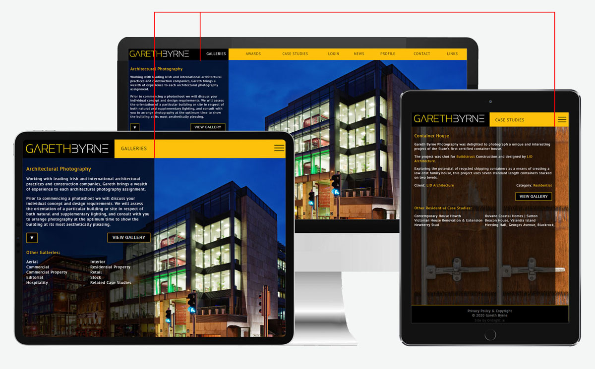
The new site for Gareth Byrne, the award-winning architectural photographer based in Dublin, Ireland, provides an easily-updated, search-engine friendly website which offers innovative screen-aware retina-resolution images and a precision adaptive mobile & tablet interface which complements and enhances Gareth's branding & and reflects his architectural attention to detail perfectly.
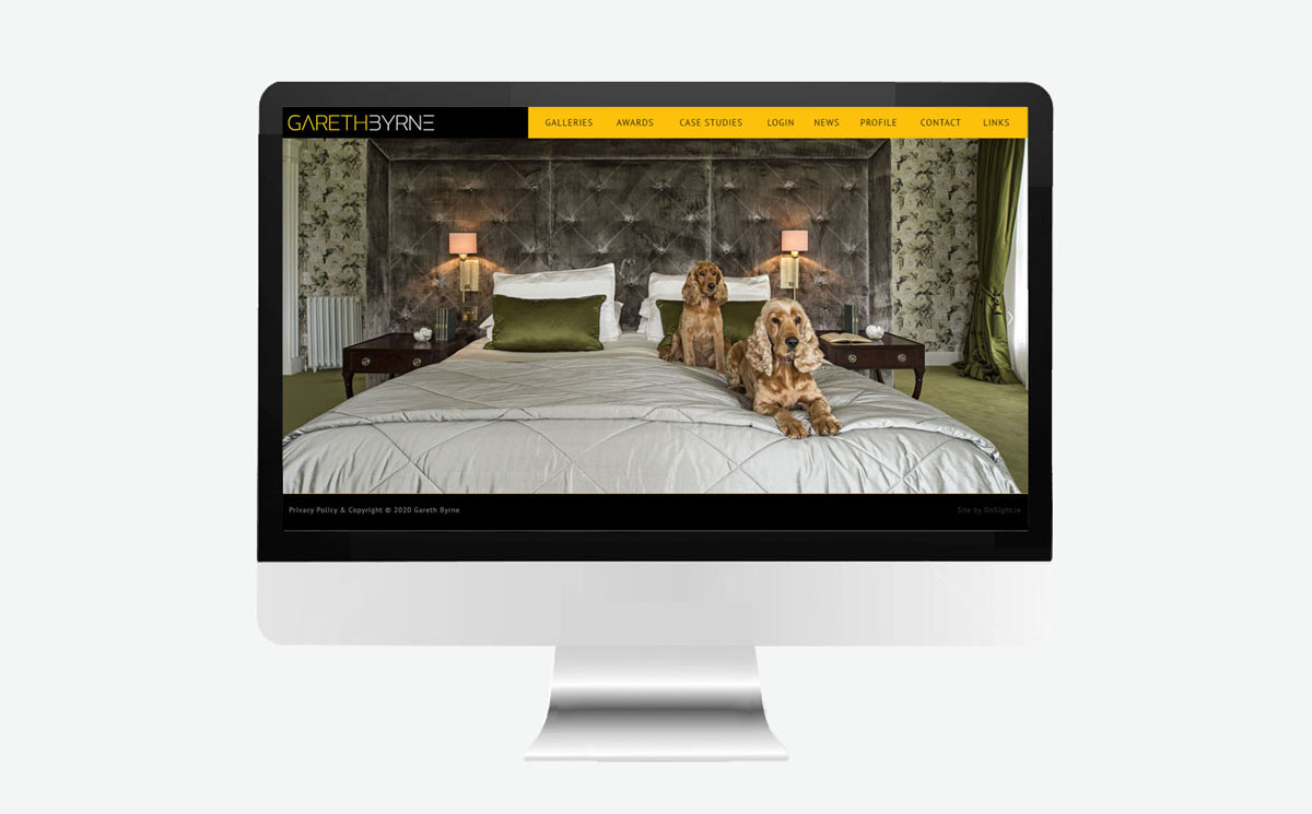
This site is easily maintained using the OnSight SiteShell, allowing Gareth to update text and image galleries with ease, and also contains additional options for cropping, sectioning & automatically creating suitable variations of the site's high-resolution images.
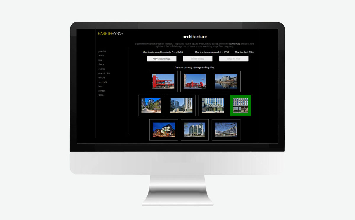
SEO-friendly content is automatically obtained from the images themselves, via the EXIF information, and the site is further structured to make the most of any additional text and on-screen information.

The site includes OnSight's lazy load technology, making it extremely fast for a site containing high-resolution retina images, while avoiding the frustrating ever-expanding phantom scrollbar issue found on many websites.
The system also intelligently overrides the inbuilt logic for retina-display smartphones when possible, so as to speed up the site and minimise the visitor's data usage when on mobile.


I've looked through it and it's fair to say that we can rest easy now as it looks perfect. It's not even live 24hrs and I've received e-mails admiring it. I'm delighted that I used your services and appreciate your hard work and dedication.
Hopefully in time more of the IPPA members will recognise your quality of work and employ your services.
This completely custom design automatically adapts to different screen sizes, auto-aligning the navigation, text panels and design features of this website, while the inbuilt SiteShell lazy-load functionality ensures that the site loads remarkably quickly.

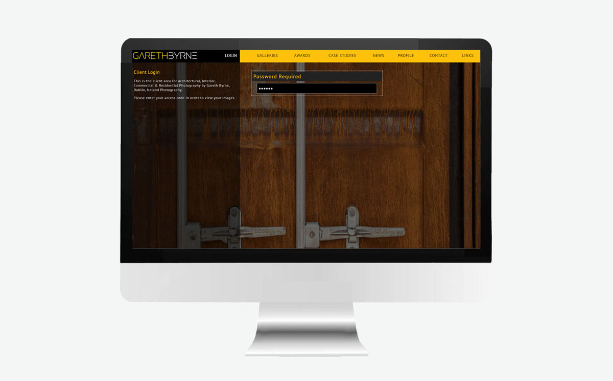
This site also includes a client login area to allow clients to log in, order and download images.
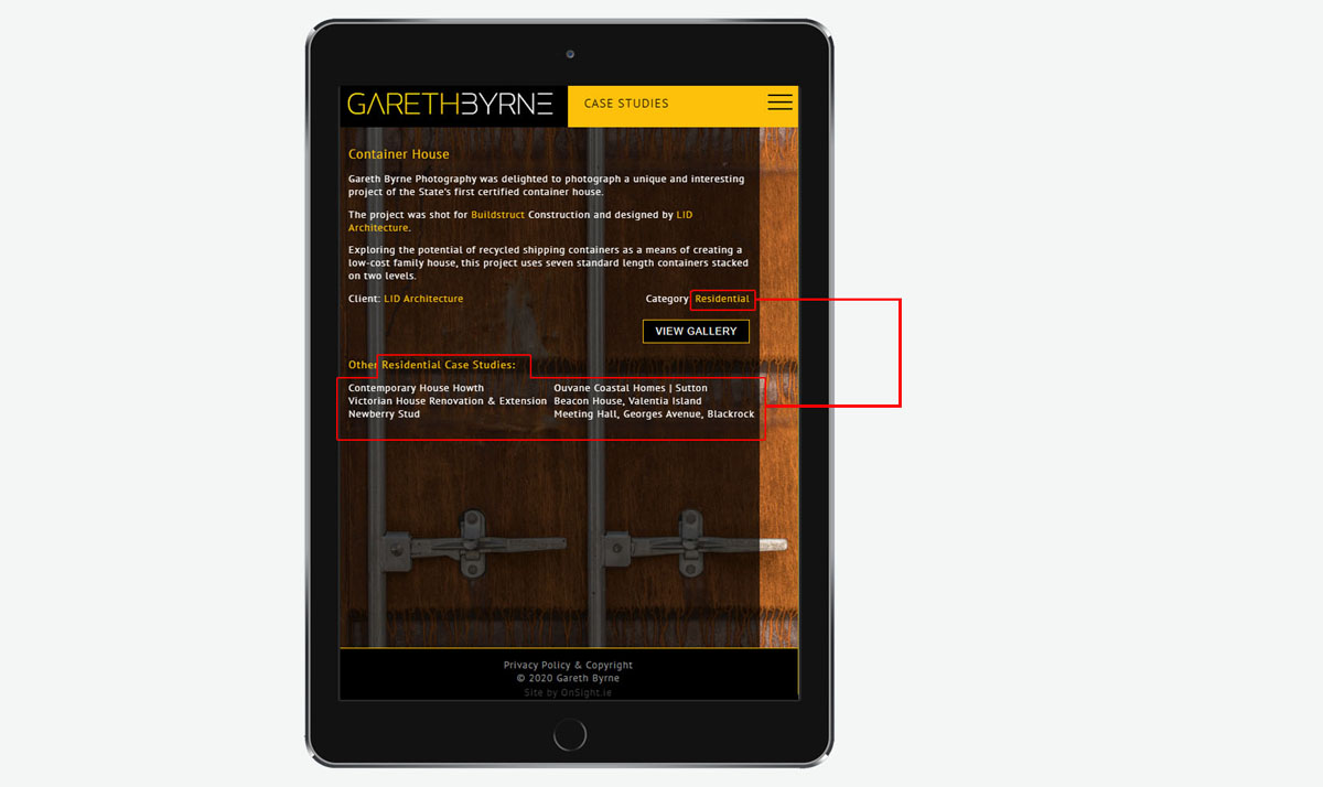
Gareth's blog & case studies are fully integrated into his site, linking to the related galleries & photographic services on his website.
Looking for a site like this? Contact OnSight today!
Enquire Online!This completely custom design automatically adapts to different screen sizes, aligning the navigation, text panels and design features of this impactful full-screen layout with architectural precision, intuitively maintaining both virtual & actual alignment.
These are the Simple Content Management
websites designed & developed by OnSight.
Make sure you check out our website solutions for other business types as well.